Cancel

MacDraft 7: In-Depth Look
New User Interface
MacDraft 7 has had a facelift, not only to modernise it’s look but to also make MacDraft more intuitive and easy to use. The new user interface has gone through maticulous design stages, where we focused on what elements were frequently used and where we could speed up your design process. We looked at all the key aspects of MacDraft from its palettes to the editing of objects. After a gruelling yet fun design phase, we came up with many iterations for design and layout, then taking the best aspects of each we came up with what you see now. We hope you like it and are certain it will bring a whole new bunch of benefits to your MacDraft experience. You’ll find more information on the key elements of the interface below, to get a clearer picture as to what the MacDraft 7 interface will bring.
Light/Dark Interface Design
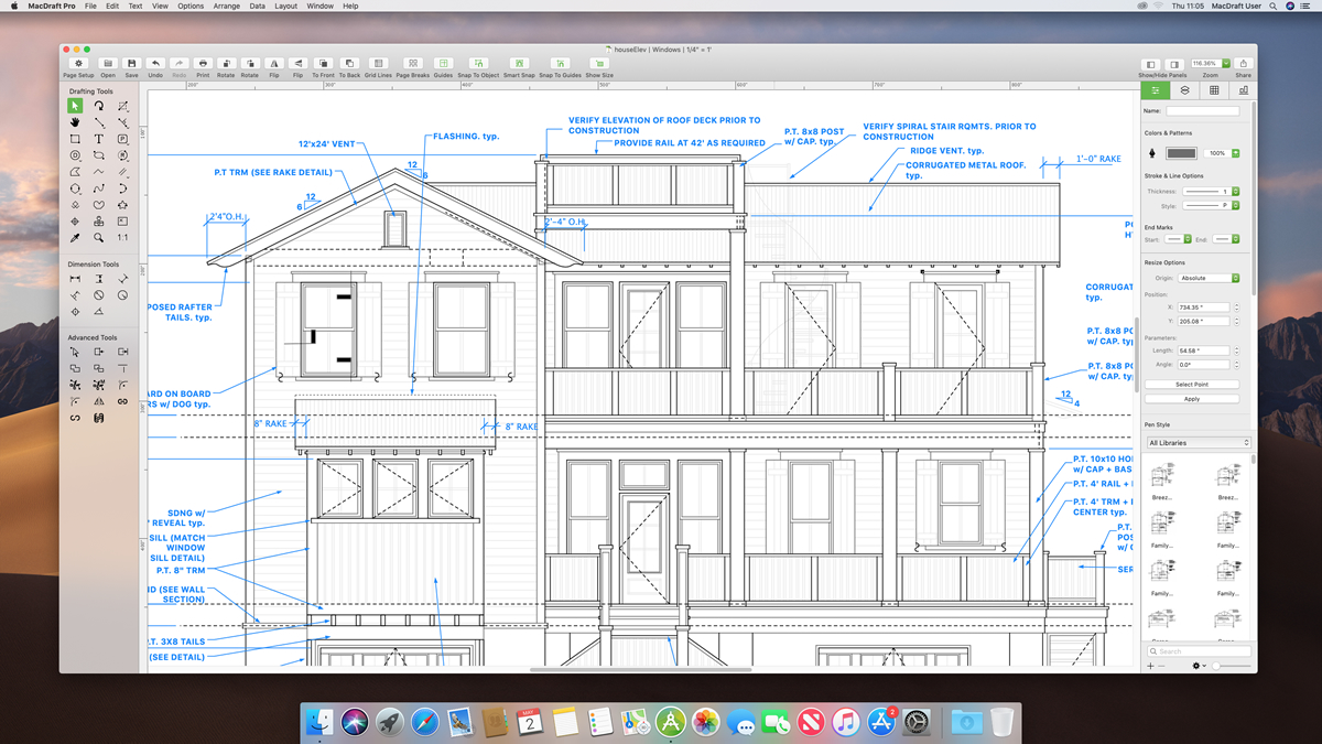
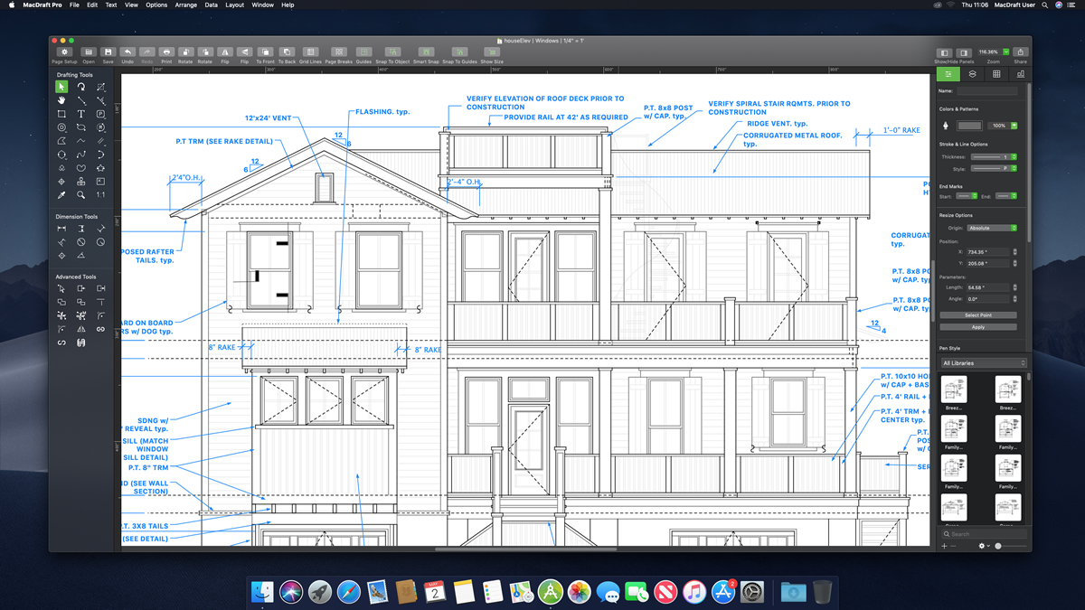
A dark interface helps to reduce eye strain and makes color association and automatic referencing of familiar aspects of an interface easier to navigate, which makes using and learning much faster to do at a glance. It is our job to make sure that not only do we provide the perfect app for your design needs, but that we also make it easy for you to use and learn.
The choice to make MacDraft 7 a dark interface was not taken lightly and the balance between aesthetic and usability has been considered throughout the whole design. The final look and feel was designed to make it clearer and more intuitve, making it easier for you to not only distinguish between the key elements, but to allow you to familiarise yourself with the different key areas and provide a clean, sleek and precise working area. In addition, we wanted to make the document area and the content you place in there jump out from the rest of the interface, bringing a whole new dynamic to your design experience.
We have also implemented a Light Mode interface design. This means that users who run MacDraft on Mojave or later will be able to swap their interface between Light and Dark mode, using the system preferences.


Retina Display Support
Now fully supporting Retina displays, MacDraft 7 looks great on all your screens. Not only that but with Retina support all your icons, text, dialogs and more are clear and concise making it easier for you to navigate and use the MacDraft features. With Retina support MacDraft will no longer have fuzzy interface elements, hard to distinguish icons or blurry images. The new interface will show crisp and high resolution artwork throughout, giving you the confidence that your design process will not be affected by a hard to read interface layout.
Single Screen Layout
One of the great benefits of the later Mac operating systems is the Full Screen Mode. MacDraft 7 has been designed to make everything you need for drawing and editing available in a single screen. This meant that we had to come up with a way to bring all the palettes and tools into one screen, while keeping MacDraft easy to use and familiar. To do this we have put all of the tools in one single panel on the left of the screen and all of the palettes stack on the right side panel. All of the properties for editing are available in one place, making it much faster and more efficient for you to edit your objects. The single screen layout has brought all the power of full screen mode, usability and an intuitive design process to MacDraft, while still maintaining an easy to use app.
Tool Options
The tool options available for some of the design tools in MacDraft have often been overlooked. We have spent a lot of time trying to come up with a way to interface the options available to you prior to drawing a shape. For example, Parallel Lines have tool options, where you can define the thickness of the walls and other options. We designed a tool options panel that will appear at the top of the drawing area each time the specific tools that include options are selected. This way there’ll be no interference with your design process and you’ll know exactly where the options are each time.
The Toolbar
We have updated all of the icons in the toolbar to be Glyphs. Glyphs are a better way of communicating the particular option or feature to the viewer and makes it easier for you to familiarise yourself with what options are available to you. We have also added a clear and concise selection state for the options that toggle on and off, that compliments the dark design.

The Left & Right Panels
We have stacked all of the tools in the left panel to make it easier and faster for you to access every tool you’ll need for your designs. We have also stacked all of the palettes in the right panel giving you one place to go to for editing and working with your drawing content. When wanting to edit your selections all of the commonly used options are available in the properties in the right panel. You’ll also be able to work with your layers, swatches and alignment from this single panel. In addition, both panels can be hidden and shown at any time.
Document Tabs
When you have multiple documents open at the same time we wanted to give you the option to store them in one single screen and navigate them through the use of tabs, rather than having multiple windows open at the same time. With this in mind we implemented the Mac OS Tab View into MacDraft 7, when you can have multiple documents in one screen, making it perfect for full screen mode and for navigating between your designs. The document tabs can be controlled via the menus, where you can turn all individual windows into a tab view or tab views back to individual windows. You can also control the tab view options in your system preferences.

MacDraft Pro 7.0
System requirements:
Machines running MacOS 10.11 (El Capitan) or later.
Includes full Support for MacOS 10.15 (Catalina).
Available through our web-store from
$399.00
£339.00
€379.00
You can also upgrade from previous versions